
g r a p h i c 1
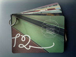
Card Calendar 2011
Little calender for 2011, each month has different type, layout and of course photo. It was intended to be more of a self-promotional gift, but with practical usage. On the back sides you'll find fine lines with dates, which can be used as birthday-reminder/ or memo / or postcards. It could be also nice to hang on the toilet wall, as you can spend your precious time pondering about your precious people's important days...


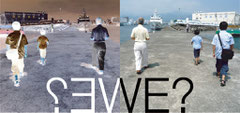
Art Moves International Festival of Art on Billboard 2010 - submitted
The work is intended to be a creative response to this year’s competition theme "Together or apart?" This slogan can serve as a kind of a metaphor of the processes taking place in the contemporary world. Both individuals and the whole societies are faced with such a choice. Do they want to live together, contribute, collaborate and, as a result create shared value, or do they want to lead a separate, individual life of their own?
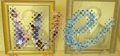
Ines Hermida
CI and stationeries for a modernist Jewellery designer Ines Hermida.
Each jewellery comes in cylinder packaging, which can be put together as many as you want and works as a storage or a handy jewellery
case for travelling.


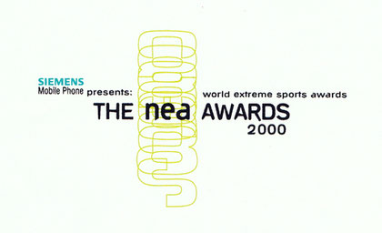
The Nea Awards
Logo experiments for an awards for young athletes.


Desktop
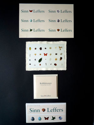
SinnLeffers (Germany)
Two German department stores merged and needed a new image and philosophy as a new company in strengh with fashion. We developped a concept "Collection - Objets Trouvets" for the logo. All 6 of them have the same importance and are to be seen everywhere in SinnLeffers world: entrances, tags, brochures....


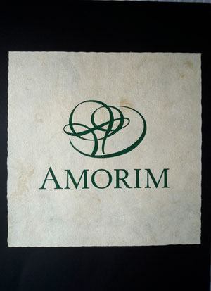
Amorim (Portugal)
A traditional Portuguese cork company wanted to revamp its corporate image to reflect its diversified global buisiness without losing its heritage.


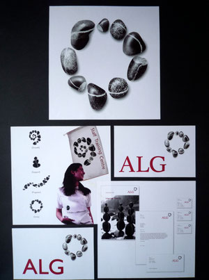
ALG Holding
It was much before the "Step Stone"! Unlike thier direct usage of the image, this was to show more of different individuals forming a harmony.


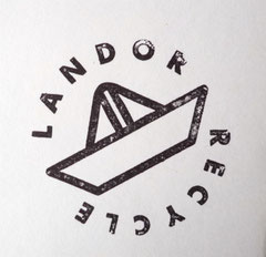
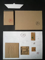
Landor recycling
A personal project has turned into a small recycling project at Landor. Out of waste copies, we made note pads for daily use. The stamp shows the Landor boat in Origami boat.
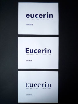
Beiersdorf AG "Eucerin" (Europe)
A well-known skin care brand in Europe wanted to renew its logo to reflect more of its philosophy.


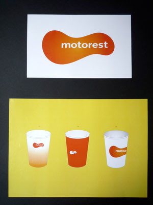
Neste "Motorest" (Sweden)
A project to creat a logo for Neste's highway restaurant chain "Motorest" in Sweden. The idea was to offer something warm on a highway, where normally woody and cold and grey.


TV Tokyo (Japan)
For TV Tokyo, broadcast code TX. They were not as characteristic as the other leading TV companys in Japan, so we wanted to give them a strong and memorable Logo showing many abilities in screen media .

Others


